


More later I hope on my favorite museum site, the U.S. Holocaust Museum. Just feast your eyes for now.
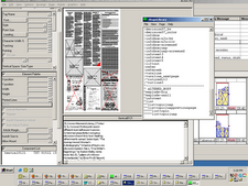
This image is from the "Plan a visit" page, and the main photo takes you there, to the gathering spot before you start your tours. It's a beginning, a planning place, before an experience. Designers rightly chose an image that doesn't plop you right into the middle of the experience, but rather gets you started. All of the information for a visit is presented quickly and well -- there's so much, though, that it can be overwhelming. I've posted in class discussions about the large accessibility guide in a pdf format, more information than I needed. Sometimes less is more.
One other small point: I tend to look at things on the web very horizontally, and I'm guessing that tendency is part of a larger trend. Designers are moving to pages optimized for about 1000-something pixels. These pages appear to be designed to be viewed about 810 to 850 pixels wide, and the design is somewhat "stretchy." So at larger widths, odd trapped "white space" appears. Perhaps a design touch-up of the site to make it as beautiful at a wider width as it is in the narrow width would be in order.
Navigation is so seemless that it took me awhile to figure out why: the navigation bar at the top, on almost all pages, built in as part of the branding page title, gets me wherever I go quickly. There's always a link to return to the home page. Drop-down menus have different colors behind them, all in a pleasing color palette. The colors sometimes match the background colors of the pages they lead to, a navigation device so visceral and intuitive that one doesn't even know it's happening as one clicks around. Not all pages match, though. It's worth further study to figure out why, or perhaps it's unintended. The palette holds everything together. Black is used on photo-intensive pages, such as the page that focuses on the art and architecture of the museum.
A beautiful, horrible place, accessible and with appeal to all kinds of people. It takes full advantage of the contrasts of lightness and darkness, transparent glass and solid brick, and passageways from one place to another.

 Images that stick with me from a real-world visit:
The shoes. I couldn't find a photo of them on a quick search. Perhaps that's intentional: no photo on a website could convey the emotional effect of that exhibit.
The faces. People like me, or like people I know. I saw faces that could've been the cousins of my friends.
The passage: Our visit was late in the day, and at closing time we were ushered out slightly before we'd seen the full museum. A long, clean, uncluttered stair passage led out to the main hall. It was a place with a lack of visual input, a place for thinking and reflection on what we'd seen. It was the equivalent of "white space" on a newsprint page or website.


2 comments:
the shoes...
anyone I know who's been to the museum always remembers the shoes. they're simply haunting.
excellent post. BTW, in addition to the overthetop .pdf accesibility guide, useful information accessibility was available several other places in more useful snippets.
Post a Comment