
Two intriguing things found while wandering:
The University of Arizona posts a public "web style" page so all people creating pages under the university's umbrella will show consistent style. In addition, the school posts a history of their website, showing versions of the home page through the years. Intriguing stuff, at the history page and the style guide.
Barbaro the horse got lots of love on Legacy.com, which uses the funeral "guest book" metaphor, and then sells hard copies of the books. Check it out here.
Wednesday, January 31, 2007
Sidetracks


Interesting things found while looking up other things:
An effective use of a line and two circles, in Guatemala City, from Skyscraper City.
A McDonald's french fry in the shape of a Nike Swoosh, for sale at Very Strange Auctions.
A public free forum on design and branding for part of Charlotte:
Civic By Design Forum: Tuesday, February 13, 2007, 5:30pm – 6:30pm, Levine Museum of the New South, 200 East Seventh Street.
"AIA Charlotte proposes a project to enhance the image, international character, urban design and architecture of the section of Central Avenue informally known as the 'International Corridor.' AIA Charlotte will work with the property owners, the business owners, nearby residents and the larger community to address the urban fabric and architectural issues that hinder the area’s development. Priorities will include ... how to build an identifiable image ... ."
Details and RSVP: Tom Low, Chair, Civic By Design Forum at tom@dpz.com.
Last but not least, "The Design Disease," similar to the "Math Curse," at Noisy Decent Graphics.
The other "W"


Changing a symbol dramatically can eviscerate its power.
For many people, the far right "W" holds a large space in their brains. They see it every day and subconsciously associate it with certain necessary functions. It "reads" when it's small, and could read better larger with a little work, perhaps through a vector? program like Illustrator.
It holds more power than that other "W" associated with politics and bumper stickers. It has no political affiliation, and it has become cross-cultural through the marketing efforts of its powerful parent company. Through many years of marketing, development and alliances with other software companies, the symbol came to represent software that was a standard for business use, something that everyone knew how to use or needed to know how to use.
Times change.
The symbol on the left is Word 2004 for Mac, version 11.2. I still can't remember viscerally what it's for as it sits on my desktop, after two years of exposure. It's prettier than its previous version, but much more symbolic, losing its connection with the letter "W." It looks like a "3" turned 90 degrees to the right. Or an "E," turned 90 degrees to the left. I've clicked on it numerous times mistakenly, thinking it was an "E" for Excel. Its color is different, at least on my Mac screen, from the "W" I see on the PC every day. The visual difference between a Mac and a PC creates a divide that should not exist.
So I get frustrated and mad at it, and end up using Outlook email to keep notes as I read.
Perhaps the symbol's loss of power for me reflects the threat the software faces in the new era of computers. Users need browsers, communication software and sometimes spreadsheets. But why even go to the odd new "W" if other software can handle the small, quick easy note-taking and writing tasks? Are Blogger and Typepad the new Word?
Pretty things work better

This beautiful symbol is readable in small and large formats, and the designer paid incredible attention to detail and color while using an almost universal symbol of music. The round shape of the CD background harkens back for older users to vinyl discs while reflecting modern media, beautiful in simplicity and useability generally across hardware and software platforms. While small cool Flash drives are wearable, past experiences for many in our culture make the CD cheaper, easier to get and easier to use. The addition of the music symbol alerts users that the program is about more than just CDs. As the software's function spreads to academic podcasts, TV shows and movies, the symbol's focus on music may become a visual artifact. But I bet developers will stick with the symbol, to build on emotional connotations burned into users' heads. It connects the visual with the auditory for strength in memory.
Quick, cheap, reliable last resort

It's 9 p.m. on a cold, rainy Sunday night.
You have a whiny hungry kid -- or kids -- in the back seat of the car. You have no time before you're supposed to be somewhere. Your stomach rumbles.
You're in sprawl-land in the Southeast or Southwest U.S.
You see these white lighted lines on a slightly angled roof. They show up in the darkness, from at least half a mile away. They succeed because they're designed to be seen amid the visual clutter of sprawl-land, even in darkness. Because they're part of a roof, they signal shelter.
Those lines are successful because they're simple, clean, visceral. Images associated with food are primal and visceral, remembered easily without words after just a few exposures.
And when zoning codes prevent a big yellow "M," these architectural details suffice.
You're home free.
At the least, you can get a package of about eight grapes and some sweetened yogurt.
The image also carries extreme negative connotations for some people, because of previous overexposure and negative portrayal of the brand in health-focused cultural subgroups. In a recent experiment, 50 percent of style-conscious, health-focused branded young consumers refused the grapes. And sulked.
Thursday, January 25, 2007
Emotional image No. 3

Visceral: Simple and appealing, though not technically beautiful. It involves muted water color, with movement, juxtaposed with a human-made, trashlike element, recycled with a clear colorful purpose filled with hope and a pencil.
Behavioral: I sought out the image after I had the word concept in my head, so my behavior changed before even seeing the image. I tentatively resolve to help or explore further the project of my daughter's photo teacher. She's taking some Photo II students to New Orleans at spring break, to document post-Katrina life, with the themes of "Message in a Bottle" and "House of Cards." Maybe the photo will affect the behavior of others, who will remember the intriguing idea of a message in a bottle from their childhoods, or they'll think about how to reuse this expensive oil-based throwaway of our modern life. Someone said Nalgene, right?
Reflective: So how much of our visual and auditory memory affects the way we approach this image? How many people are humming the Police song "Message in a Bottle" now? How is such a concept connected to Katrina and New Orleans? Surely plastic bottles filled with water could have saved some lives. How cross-cultural is the image? I know the idea is floated in Europe, but does it hold water in Africa? In China?
Credit: A class project far away.
How to do a class project: Apparently, there's some grant money around for such things. Ideas here.
Emotional image No. 2

Visceral: Lack of color immediately makes me feel this is real, documentary, serious stuff. Flowing folds of fabric convey warmth, and sparkles convey luxury and a special occasion. The exotic differences in clothing and facial coloring intrigue, while the familiarity of an elder helping a younger one makes me connect to the people.
Behavioral: The photo makes me want to go see more from the same exhibit, "Families of Abraham," and also make sure I follow up in conversations with my daughter about the exhibit. Her first reaction on seeing an ad for the exhibit on TV was to say, "That's wrong! Indians aren't families of Abraham!" because all the Indians she knows are Hindu. So the exhibit has the ability to quash some stereotypes, with just an ad.
Reflective: (One paragraph, or at least a short posting, I resolved.) I ponder this exhibit's presence on the web and in other media. At the Levine Museum's official site, I don't get enough. I can't click on the images and get big or more photos, and I don't get a slideshow. All on purpose, I realize, to make me go see the exhibit and perhaps look for a forthcoming book. And to protect the work of the photographers, who I know and respect. At the local newspaper's website, I fume about how disjointed and unfindable is coverage of the exhibit, despite beautiful displays in the printed newspaper. I have to go here and then here to get full coverage, and just one day ago, there was a link from the verbal coverage to the multimedia slideshow. Now it's gone. It's not even secondary, which irked me earlier because I'm convinced the visual coverage of the exhibit should come before the verbal coverage.
And I'm willing to bet the verbal coverage may die out and be accessible only through a fee before the exhibit runs its course.
I ponder and fume and resolve to try to find a way to influence such coverage in the future.
Emotional image No. 1

Visceral: Smooth large arcs contrasted with small angular elements create energy, and blues and greens add serenity. Implied texture and technique create a feeling of home. Serene, homelike energy?
Behavioral: The line of buses reminds me of bat-out-of-hell driving to deliver a couple of young ladies to the UNC-Georgia Tech game. I resolve to investigate how to get on those buses for any future trips. I buy a pack of note cards by the designer. And I resolve to document my mom's efforts using the same technique to create a picture.
Reflective: I continue to think about the colors and contrasting simple shapes this designer uses to create tension and peace at the same time. I marvel at her editing and distortion of a scene, and wonder at her ability to rise above it to see views that really are impossible in real life. And I realize the emotional power of this image works best for those who have experienced a basketball game day, noting that we bring our memories to the images we see, and memory seems so closely tied in to visual elements. Think of the souvenirs we buy.
Credit: Photo of a textile collage by Elaine O'Neil, displayed at The Laughing Turtle on Franklin Street in Chapel Hill. Artist's website.
Wednesday, January 17, 2007
To gnome

Emo the gnome hangs out near a small pump house at my aunt's house in the N.C. mountains.
He's roundish and unthreatening and, of course, dressed in blue and bluish-lavender, with accents of green frogs and a tiny hint of butterfly brightness.
He's an emotional image on three levels: viscerally, and those other two. Viscerally, his face peers up from a non-threatening size and level. Round cheeks and nose are reminiscent of baby faces, despite the beard. Mid-level, his presence makes me want to decorate his house with small plants. It should be presentable for any young people who happen by.
On that higher level, I'm reminded of fairy tales and fantasy, and good magic. And closeness to the earth and its creatures.
He's almost too cute, for those old enough to remember the ubiquitous gnome images from the late 1970s-early 1980s.
That almost-too-cuteness makes me consider borrowing him from his usual spot and taking him on a road trip, seeking incongruous surroundings to make him less cute, more ironic. Already been done, I know. But worth considering. Maybe he needs a Facebook page instead. Who wouldn't be his friend?
Tuesday, January 16, 2007
Loving the penguin before it was cool

Residents of my neighborhood in Charlotte have been fans of The Penguin Drive-In for years. It's not really a drive-in restaurant anymore, but its history is a large part of its charm. Elvis is still on the juke box, as well as modern rock and roll. Families go there after soccer games or church, and then it slowly morphs as the night goes on to a more rowdy place, with beer and mixed drinks. Some nights in summer, alternative bands play in the parking lot, and the party spills into the street.
It has neon as well as this sign, and right-wing bumper stickers over the bar. One sign, "Thank a vet," has no irony attached.
The Penguin started as a greasy spoon drive-in, with no enclosed sit-down restaurant area, and has matured into a funky neighborhood hang-out. Those from other parts of the city and country feel as if they're part of an exclusive club if friends have introduced them to The Bird.
Waiters and waitresses seem to be required to have tattoos and piercings.
It sells irony, openmindedness, satire, exclusivity (you hear about it from friends and neighbors, not advertising). It sells good greasy burgers, sweet-potato fries, fried pickles and cheap beer.
It's bold -- red and black -- but the absence of background color makes the penguin what he is.
"Food" is stretched out. "Drinks" are squeezed in, making the sign pleasantly lopsided and not too polished. That would be the style error at The Penguin -- being too polished.
But oh my, that trapped white space. Does The Bird need a new sign, or do his flaws contribute to the retro feel and make him what he is?
For more images, search Flickr for Penguin and Charlotte. At Facebook, a group called "People who LOVE THE PENGUIN!!" has more than 180 members.
An earlier owner was a World War II veteran who recently died, Jim Ballentine. He was of the neighborhood, and his customers frequently thanked him for his service in the battle of Bastogne, according to his obit in The Charlotte Observer.
May the Penguin party on, long after the current fascination with the Bird fades away.
Friday, January 12, 2007


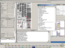
Browser wars

Sometimes I'm hopeful that our brave new world will someday work seamlessly, whether we're talking software or international boundaries and governments.
Other times, I realize we have a long way to go.
I think this image tells a very short story of where we are now. It's like a college essay prompt I heard about last night: "Imagine you've written your autobiography. Tell me what's on Page 217."
This shot is Page 217 of our technical evolution.
Documentary wedding photography
It's not an oxymoron.
Observer photographer Christopher Record recently resigned to pursue his documentary wedding photography business full time.
He tells lovely stories of couples starting their lives together here.
He captures the little moments that foreshadow the future. He beautifully documents the hands, the fabric, the eyes and the smiles at weddings. There's no sound at his site, but you hear the music by looking at his photos.
Yes, this is a plug for Chris. But his work is evocative and truly tells stories about people at turning points.
Now imagine telling the story after the "happily ever after" part.


Thursday, January 11, 2007
Subscribe to:
Comments (Atom)

