Part of journalism's function is providing an outlet for the steam to get out of the teapot before the teapot explodes.
That's an idea that's been around since the Revolution, and is one of the legs on which the First Amendment stands.
The steam also lets the truth out: lots of people are racist, misogynistic and angry. They often target powerful women or those who are different. Psychology students would have a field day with how the Internet has made "redirected aggression" more visible.
That visibility has made some bloggers and forums go silent, and that's the wrong response.
A diversity committee at one newspaper is lobbying for comments on stories to be turned off. An editor at another paper seems to have minimized her blogging because a few trolls took over her comments. A tech blogger elsewhere canceled travel plans because of death threats.
News sites have to be smart about how they handle community. Dialog is important, but technology exists to monitor that dialog and to direct it. We can create places where the trolls can rant among themselves, letting the steam out. We can monitor comments or create Q&As instead of blogs to control the amount of time spent managing postings.
We can let ranters hoist themselves on their own petards.
I'm not saying anyone should stand in front of moving bulldozers, but we distort the truth of our society if we go silent or refuse to let the ranters have a voice.
Elie Wiesel: " Speak up!"
Friday, March 30, 2007
Wednesday, March 28, 2007
Creating community
Thoughts from conversations among journalists, examining how various papers are using the Internet. Most names expunged, to protect the innocent:
"I sometimes wonder if the drive for massive interactivity with readers isn't getting ahead of where time-starved readers really are...Checking several of (a small Carolina city's) top blogs was depressing. Good postings - many on controversial topics - have produced no online response."
It's a good point, and we need to encourage responses by rewarding those who contribute. For specific ways to generate buzz on blogs, ask Mary Newsom how she developed her community at her blog, The Naked City. Sometimes she spread the word about specific postings by old-fashioned talking. She used her real community to build her virtual one.
Minneapolis developed "karma points" at Vita.mn Surfers want other people like them to review restaurants or clubs or books, but many don't want to take the time to write themselves. Thus rewards. And rewards don't have to be concrete.
And for specific tasks, like finding an obit, submitting a wedding announcement, sharing a story idea, the website should make the work easy and fast. Sometimes five or 10 minutes is all readers will give, before they turn away and don't come back.
With its "Taking Back the Neighborhoods" series, I think the Observer found how effective initiating "community conversations" can be. Instead of just hosting "town hall meetings" where a couple hundred attend, though, imagine hosting online forums where thousands can participate.
Have you seen how hard it is for the Charlotte group at Flickr photo sharing to get people to turn out for an event? Rewards are needed, beyond coffee and cookies. But it's clear that volunteers in the community aren't having good success with organizing real events from online communities, so that's a place we could succeed if we give it enough energy/money and time. One of Newsom's Naked City commentors proposed a meetup recently, where blog commentors could duke it out in person (verbally, I'm sure).
One specific news event that does create community: zoning battles. We should find a way to host the conversations that go on online and in face-to-face meetings about zoning and development. I know a developer who's planning on building some stuff near me, and he wants an online place to post sketches and get neighborhood feedback. A volunteer in the neighborhood hasn't had time yet to make a custom website: Imagine if charlotte.com could become that place.
Shouldn't we also ask about results? In other words, when we ask about new features on the internet or in the paper, shouldn't we ask if the newspaper has measured any increase in hits or readership as a result?
The managing editor in (a Midwest city) brought this point home in an interview as well. She meets people at conferences who are excited about a new toy, but have no idea whether it's increasing traffic. We should beware falling for the newest gadget if it doesn't work by adding readership or increasing useability.
Tuesday, March 27, 2007
Grids aren't just for templates

This page, posted under "Favorite pages of all time" at Visual Editors, shows that grids allow designers to organize lots of information, or allow them to show how one thing is different from (than?) all the others. Uses symmetry, balance, alignment, and then just one quirky little different thing, to emphasize difference. It's for "Star Wars: Attack of the Clones."
Tuesday, March 20, 2007
Finding foreclosures
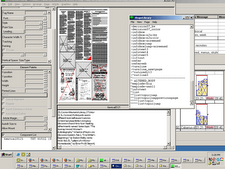
For a class assignment on activity-based design, I decided to look up details on charlotte.com about foreclosures in my neighborhood and my area of town.
I knew the map existed because it ran in the paper, out of register, and had "refers" to an interactive map online. I and others had tried to access it previously, when the first refers appeared over the weekend, and then also during regular business hours on Monday. The connection would generally time out, because the server was overwhelmed with hits from others. I also knew this search would have elements of systems-based design because it's using a database, and I've done similar property searches in the past.
Here are steps:
Go to charlotte.com
Found latest foreclosure story right away, because it's part of a continuing series and thus at the top of the page.
Found interactive map link right away.
Clicked on map link at 8:11 a.m. Map came up within 30 seconds, much better than previous hits. Perhaps we should've published a note for readers/surfers when the map was first put on the site, warning users that initial traffic would be heavy, and interested parties could come back later for more successful service. If readers tried earlier and it didn't work, I suspect many may have given up, decided it was "broken" and not worth a retry.
Viewed source (wouldn't normally do this.) Info says: ArcIMS is the mapserver, MS SQLServer the street data server, with scripting in ASP and VBScript. Wish it was a Google map, which I'm comfortable with using because of previous experience.
Found general visual of cross streets of my side of town. Previous web surfing has honed my skills in this area, and my brain remembers the visual picture.
Clicked once to zoom in, got general picture of my area of town and the density of foreclosures. Saw nearby neighborhood with lots of foreclosures; saw that my neighborhood had some, but not many compared to visual representation of county as a whole.
Clicked to zoom in again. Waited about a minute.
Next picture gave me specific neighborhood info, with identifiable houses and streets.
Clicked on left of map, trying to recenter. Waited about 20 seconds. Map didn't recenter. Maybe I didn't have "recenter" radio button checked.
Map defaults to "show property info" radio button being checked, so I decide to see what info. I can get on a specific house in my neighborhood.
I click on square for a house. I get a box with specific address, and information that tells me to click again on it to go to county property info to learn more.
I click on info. link, and get quick info in a new window, in a systems-based form, about all sales for the house, and see it took 11 months from time of foreclosure to close of sale to a new real owner, not a bank. Speed seems to indicate the county servers are much larger/faster/closer than the ones hosting our map.
I close that window and return to where I was previously.
I try the recenter button to look at nearby area with lots of foreclosures. It recenters.
I click again to get property info., because I'm not trained to have to click a radio button to change my request for info. I expect the computer to know what I want to do by how close I've zoomed in.
I wait 30 seconds, click "show property info." radio button, click on a particular house in a cluster of foreclosures, and wait for about a minute.
Actually wait about 2 minutes. I renew my coffee while waiting. Return to computer.
Box showing three addresses comes up and asks me to click to go to county website for more info. I choose and click one address, and systems-based info. comes up quickly. I look over data, close popup window.
Stop, deciding I have enough info. Brain remembers general details about housing size, quality and price, and notes that more than one foreclosure on a street or cul de sac seem to affect surrounding homes, while isolated foreclosures seem to have little effect. Also note that revaluation rates also seem to have an effect -- those with higher tax values face more foreclosure issues in some neighborhoods.
Try to figure out how to return to charlotte.com from map. No obvious link back to home, so I use back button. Eight clicks.
I'm home, scan the news, click on one or two spot news stories, find blogs (for which I've been trained), visit a couple (69 responses to a transportation post, plus a proposal to meet up in person and discuss the issues!), four responses to "What is the new adulthood?" by a different blogger, all fairly surface.
Done.
Saturday, March 17, 2007
New header
Lots of learning here; still not totally satisfied.
Decided to try the whole thing in Photoshop elements, including the type.
Type is Trebuchet, color is #dbf2bb. Made a shadow of the type with a different layer, Gaussian blur. Old technique from the recesses of memory, taught by Ted Yee, now in Chicago. Probably a trick that is mostly out of style now, but gives depth and readability when type sits on a background.
Background is a "paper" swatch, lightened to color #c9bc9f.
Newspaper image also found on the web, desaturated wih primary color of #d3d8d6.
Another layer on the background is of Courier type, with words and codes from class, blurred and lightened in Photoshop.
Produced at home on the Mac, where I have more font choices than at work.
Played it safe in terms of colors; perhaps too safe, thinking that colors will look brighter and less subtle on a PC.
Need ways to add the lovely red, yellows and greens from the inspiration images, subtlely (is that spelled right?).
Learned that layers in Photoshop are my friends. They help me make mistakes faster. Just play with plenty of layers, delete the ones I don't like, SAVE an unflattened copy, then flatten. Sizing indeed a dilemma; still not exactly where I'd like it. Cheated and made borders the same color as background to make them disappear; same with header words. Probably need to add an "alt" thing somewhere.
Thursday, March 8, 2007
Web-safe colors vs. not


I totally missed or read and forgot Serena Fenton's class forum post of Feb. 27 under Blog Pointers. She said, "Ick, Don't use!" about sticking to a palette of 216 web-safe colors.
So here's a comparison of two analogic color schemes from Color Scheme Generator. The one on the top has been "reduced" to web-safe colors. Saved these as screenshots with Photoshop as JPEGS, based on something posted at Lynda.com, but I'm not sure whether I did everything right, or what Blogger might've done to the images on upload. So we'll see, on different monitors.
This Blogger preview is not WYSIWIG. Played with margins to fix this layout, trying to avoid type between the images. Preview isn't playing along.
Wednesday, March 7, 2007


Tuesday, March 6, 2007

Compression word play

Final word for wordplay project. Created the document with the background set to transparent in Photoshop Elements; maybe the preset was defaulting to white, giving me white background no matter what other manipulations I tried. Was much faster, of course, than the first word yesterday. Couldn't manipulate colors for some reason. Probably not enough coffee.
Started to do it in Word; flashed back to some middle-school newsletter work, and said "Nah." Why fight the machine?
Monday, March 5, 2007
Eliminate the dots

Flattened and erased. And then smudged, just for fun. Thanks, Tom.
I keep saying I'm going to set aside some time just to play with Photoshop, and its amazing creative toys. But other things always push it aside. Good to have assignments that specifically require this work.
"Compression" will have to wait for another day; spent too much "class time" surfing and thinking about browser window size. See diarrhea under class discussion of "Banner and Type creation" under Tom "Socrates" Clapham's question, "Does size matter?"
Sunday, March 4, 2007
Type warmup, first word

Here's half of the Word exercise from Ellen Lupton. I tried this in Photoshop Elements, mainly because I don't have design software at home yet. So figured it was time to learn what Photoshop Elements could do with type.
Leading, or spacing between lines, was really hard to control. But it was at least intuitive. I think that's maybe why people who are good at Photoshop rarely seem to be good teachers for others. They just click around until something works, and then their eyes or fingers remember how they accomplished something, but not their conscious verbal minds.
There must be a way to crop out or erase the dot on the "I"s, but I didn't figure that out yet. Clues welcome.
I considered the "N" on the first line, in red, but really liked using "nation" on the second line altogether. Thought about repeating, with first line being e-l-i-m-i-n and second line being n-a-t-i-o-n. That might've worked better.
Used Futura medium, though considered Future condensed extra bold. Kerning, or the space between letters, of "nation" bothered me in futura medium, but didn't know how to change that.
Second try in posting -- set background to "matte" in Elements when "saving for web," and then chose the same color background as the web page (currently). Don't know why it wasn't totally transparent at first; I think it was a failing of my use of layers (or lack thereof) when building it in Elements.
Dern, on Try No. 2, the background still looks white. Surfed for answers briefly, didn't find anything, but did find good stuff at Mandarin Design.
Thursday, March 1, 2007
Web site critique, Museum of Modern Art

The website of The Museum of Modern Art offers different experiences for different users on various pages.
The main pages and store are quite structured with much use of gray and gray-blue to guide the eye. Links are on the left. A large changing Flash “exhibit” is at the top. The “F” structure theory for web pages is very much in evidence.
The Flash animation at the top is quite busy, with as many flashy fades and spins as a young PowerPoint user would use. The Flash cycles among several exhibits, and the style of each cycle reflects the content of each exhibit. Typography of titles and exhibition dates reflects the style of content as well, and complementary colors are used as backgrounds.
As a relief, the rest of the website’s main page is quiet, structured, organized and unmoving. No popup ads, and right-side links to the Moma store and membership information are understated and undersized. Background is white, and section separators are thin gray or gray-blue lines. Visited links do not change color, except on the links sidebar, and underlining is used to indicate what is a link, again, except on the link sidebar. On the sidebar, hovering turns the links chili-pepper red.
In fact, very little on the main page is NOT a link, creating a feeling of rich content below a clean, “simple” surface.
The main page looks like a four-column layout. Specific exhibition pages are two columns, with links remaining on the left and a strong gray-blue horizontal bar at the top echoing the “F” shape. Resizing the window does not change the shape of the page – content on the right just disappears, but because links are on the left, the window can be resized very vertically to take up only a small amount of screen space and still be navigable.
By contrast, specific pages under the “Education” link for children and teens are brightly colored.
The Red Studio for teens has a pinstriped red and black background. Bright red accents the page in numerous pages and fades into gray. Typography for teens is a strong, bold sans serif, frequently white on a color background. Colors are primary.
On the children’s page, Destination Modern Art, colors are subtler, almost pastel but a little more grown up. It’s all Flash, with occasional real photos interspersed with cartoon characters with children’s voices. The main narrator’s voice is a woman. Navigation buttons are large. Very little text is present, and it uses comic-like drawn typefaces instead of traditional type. I’m reminded of a computer game from the mid-90s based on “The Magic School Bus” books.
The rich content of the site, aimed at several different audiences, conveys the idea that the site itself is a destination, a place to spend lots of time on audio and visual information about art. There seems to be an underlying outreach component, intended to educate through the Internet and not just intended to get visitors or members to the museum. Just randomly shopping at the store provided me with a calming, creative feeling, even at work during 30-second intervals between other tasks. Now I crave a $6 well-designed snow-globe ring.
The site conveys a clear feeling of being designed to be simple and clean, but with lots of complexity behind the thought processes to design it. The Flash stuff almost makes me dizzy on the main page, and feels a bit overdone, but the overall site makes me want to visit and be a part of the museum. I’ll come back to this site often, and send others.


Subscribe to:
Posts (Atom)