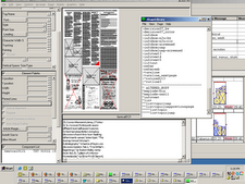
The website of The Museum of Modern Art offers different experiences for different users on various pages.
The main pages and store are quite structured with much use of gray and gray-blue to guide the eye. Links are on the left. A large changing Flash “exhibit” is at the top. The “F” structure theory for web pages is very much in evidence.
The Flash animation at the top is quite busy, with as many flashy fades and spins as a young PowerPoint user would use. The Flash cycles among several exhibits, and the style of each cycle reflects the content of each exhibit. Typography of titles and exhibition dates reflects the style of content as well, and complementary colors are used as backgrounds.
As a relief, the rest of the website’s main page is quiet, structured, organized and unmoving. No popup ads, and right-side links to the Moma store and membership information are understated and undersized. Background is white, and section separators are thin gray or gray-blue lines. Visited links do not change color, except on the links sidebar, and underlining is used to indicate what is a link, again, except on the link sidebar. On the sidebar, hovering turns the links chili-pepper red.
In fact, very little on the main page is NOT a link, creating a feeling of rich content below a clean, “simple” surface.
The main page looks like a four-column layout. Specific exhibition pages are two columns, with links remaining on the left and a strong gray-blue horizontal bar at the top echoing the “F” shape. Resizing the window does not change the shape of the page – content on the right just disappears, but because links are on the left, the window can be resized very vertically to take up only a small amount of screen space and still be navigable.
By contrast, specific pages under the “Education” link for children and teens are brightly colored.
The Red Studio for teens has a pinstriped red and black background. Bright red accents the page in numerous pages and fades into gray. Typography for teens is a strong, bold sans serif, frequently white on a color background. Colors are primary.
On the children’s page, Destination Modern Art, colors are subtler, almost pastel but a little more grown up. It’s all Flash, with occasional real photos interspersed with cartoon characters with children’s voices. The main narrator’s voice is a woman. Navigation buttons are large. Very little text is present, and it uses comic-like drawn typefaces instead of traditional type. I’m reminded of a computer game from the mid-90s based on “The Magic School Bus” books.
The rich content of the site, aimed at several different audiences, conveys the idea that the site itself is a destination, a place to spend lots of time on audio and visual information about art. There seems to be an underlying outreach component, intended to educate through the Internet and not just intended to get visitors or members to the museum. Just randomly shopping at the store provided me with a calming, creative feeling, even at work during 30-second intervals between other tasks. Now I crave a $6 well-designed snow-globe ring.
The site conveys a clear feeling of being designed to be simple and clean, but with lots of complexity behind the thought processes to design it. The Flash stuff almost makes me dizzy on the main page, and feels a bit overdone, but the overall site makes me want to visit and be a part of the museum. I’ll come back to this site often, and send others.


3 comments:
So I've gone leftie, inspired by MOMA, and I've given up on #FFFFD1, and I've given up on the Flickr badge, which doesn't work from corporate sites that warn people about Flickr.
I'm buying into chili pepper though. Reminds me of "Observer Red," from about 1996.
It's amazing how overdoing even little things makes a site that much less appealing. I don't like the pictures whipping around at the top.
I think what bothers me most is the speed with which they move. If I were overseeing the site, I'd slow the motion down and made it more of a blend.
Post a Comment