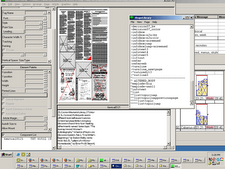
Lots of learning here; still not totally satisfied.
Decided to try the whole thing in Photoshop elements, including the type.
Type is Trebuchet, color is #dbf2bb. Made a shadow of the type with a different layer, Gaussian blur. Old technique from the recesses of memory, taught by Ted Yee, now in Chicago. Probably a trick that is mostly out of style now, but gives depth and readability when type sits on a background.
Background is a "paper" swatch, lightened to color #c9bc9f.
Newspaper image also found on the web, desaturated wih primary color of #d3d8d6.
Another layer on the background is of Courier type, with words and codes from class, blurred and lightened in Photoshop.
Produced at home on the Mac, where I have more font choices than at work.
Played it safe in terms of colors; perhaps too safe, thinking that colors will look brighter and less subtle on a PC.
Need ways to add the lovely red, yellows and greens from the inspiration images, subtlely (is that spelled right?).
Learned that layers in Photoshop are my friends. They help me make mistakes faster. Just play with plenty of layers, delete the ones I don't like, SAVE an unflattened copy, then flatten. Sizing indeed a dilemma; still not exactly where I'd like it. Cheated and made borders the same color as background to make them disappear; same with header words. Probably need to add an "alt" thing somewhere.
Subscribe to:
Post Comments (Atom)


6 comments:
Great job - especially with the faded writing paper!
I have had troubles with sizing as well. I create the banners at a larger size, say 800 pixels by 100+ pixels, but when I upload them to flickr.com, they are downsized to 500 pixels width. I see yours is larger than that, and that you are using flickr, so I wonder what I'm doing to cause it.
I used the techniques in the tutorial "Adding a graphic to your blog," using widgets.
Matched the coding in HTML to allow widgets to be added above the header. If you use "4" or more, you can "Make mistakes faster" and keep trying until you get it right.
Clicked the button to "add picture," above the header and then steered to the image on my computer rather than on Flickr. Couldn't see the sense in going through Flickr, one more step where resizing might happen inadvertently. Kept changing the size of the original graphic on my computer until I got it CLOSE to right. That's why edges of type might be a bit softer than the should be -- I downsized and then sized up.
UNCLICKED "shrink to fit" when uploading to Blogger. It defaults to being clicked, so doublecheck it.
Found out that in Photoshop Elements, if you have your pixel dimensions right, but then shrink the document size, your pixel sizes shrink too.
"make mistakes faster" :-)
I'd say I got quite a lesson in that this week.
I also did the "add widgets" thing to get my image up loaded. I'm not sure I've learned that much about the widgets Blogger offers, but I do understand a little more than when I started this week.
Have you done much else with the Widget functions?
Leslie,
I liked Blogger's use of widgets because it essentially made some of the HTML work drag and drop.
And I've built a Flickr widget and put it on a blog or two. Was incredibly excited about that at first, but success or emotional tie to that requires more work -- community building, giving back to those providing the content somehow. Not essential to getting the content, but feels essential to building the expansion of the idea. And it was limited as well by the big giant "WARNING" message that appears on some corporate computers when one tries to access certain sites. Case study details some other time.
Just so you know, you can add style to text in PSE. For example, that drop-shadow on your header...start a type layer, click the drop-down layer style and select how much shadow you want. If you don't like the presets you can take manual control over the distance, direction etc of the shadow by clicking on the little icon that shows on the active type layer.
Have fun with it.
Thanks.
Allan
Thank, Allan. I appreciate the tip. Need to get back to Photoshop and play some more soon.
And just curious: who are you and how did you get here? Not that I mind; I guess it's just a natural human reaction, like when I barged into the Charlotte Flickr group online and got curious questions about what I was up to.
Post a Comment